Colors are more than just pigments adorning our walls and furniture — they are a silent language that speaks to our emotions and shapes our moods, thoughts, and behaviors. In interior design, mastering color psychology is a powerful asset for designers, allowing them to craft spaces that are not only aesthetically pleasing but also functional, comfortable, and expressive of the identity and character of their users.
What is the Psychology of Color?
Color psychology is a discipline that explores how various colors influence human emotions, perception, and behavior. While personal and cultural backgrounds may shape individual reactions to colors, certain universal associations between colors and emotions have been widely recognized.
The Influence of Primary Colors in Interior Design:
- Red: A powerful, vibrant color symbolizing life, energy, passion, and excitement. It also conveys boldness, enthusiasm, and can evoke feelings of anger or alertness. In interior design, red is best applied in carefully considered accents to introduce drama or highlight focal points. It works beautifully in social areas like dining rooms or reception spaces, while being used sparingly in bedrooms or relaxation zones.
- Blue: A soothing color that conveys calm, peace, stability, and trust. Often linked to serenity, tranquility, and loyalty, blue is an ideal choice for bedrooms, bathrooms, and office spaces, promoting both focus and relaxation. However, excessive use or very dark tones of blue may create a cold or distant atmosphere.
- Yellow: A vibrant, uplifting color symbolizing happiness, optimism, creativity, and mental stimulation. It radiates warmth and a welcoming atmosphere, making it a popular choice for kitchens, living rooms, and office spaces where energy and positivity are desired. However, when used excessively or in overly bold shades, it may lead to visual strain or feelings of restlessness for some individuals.
The Influence of Secondary Colors on Interior Design Atmospheres : - Green: A color that reflects nature, growth, balance, and harmony. Associated with health, renewal, and tranquility, green is gentle on the eyes and versatile across various interior spaces — from living rooms and bedrooms to office environments. It promotes a refreshing atmosphere and fosters a sense of connection to the natural world.
- Orange: A harmonious blend of red’s energy and yellow’s brightness, symbolizing vitality, warmth, enthusiasm, and sociability. It is a welcoming, vibrant color often favored in living rooms, dining spaces, and play areas to cultivate a lively, uplifting environment full of warmth and joy.
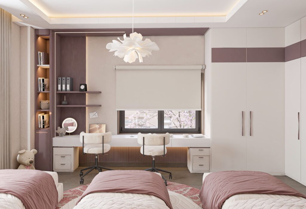
- Purple: A rich, regal hue symbolizing creativity, spirituality, mystery, and wisdom. It brings an air of elegance and sophistication to interiors and works beautifully in bedrooms, relaxation zones, or areas that call for an artistic ambiance. Careful use is recommended, as excessive application may create a heavy or overly somber mood.
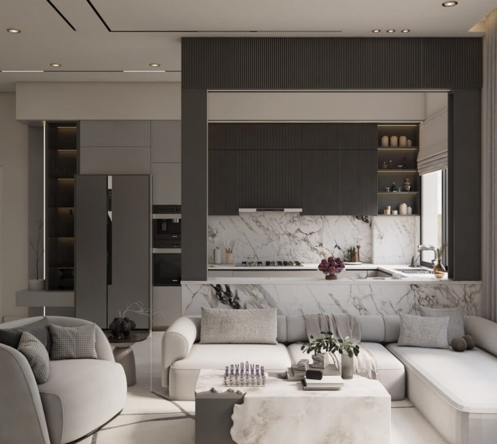
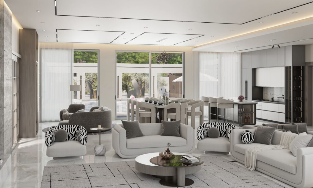
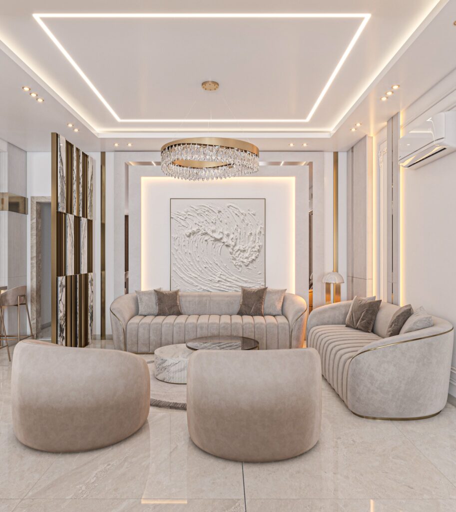
The Role of Neutral Colors in Interior Design : - White: A symbol of purity, simplicity, cleanliness, and openness. It acts as a perfect neutral canvas to highlight other colors and enhance natural light, making spaces feel brighter and more expansive. When overused or left unbalanced, it may come across as cold or uninspiring without complementary hues to soften its effect.
- Black: A powerful, elegant, and sophisticated color often associated with mystery and refinement. In interior design, it’s an effective tool for introducing depth, contrast, and dramatic accents. However, it should be used thoughtfully, as excessive use can visually shrink a space or create an overly somber atmosphere.
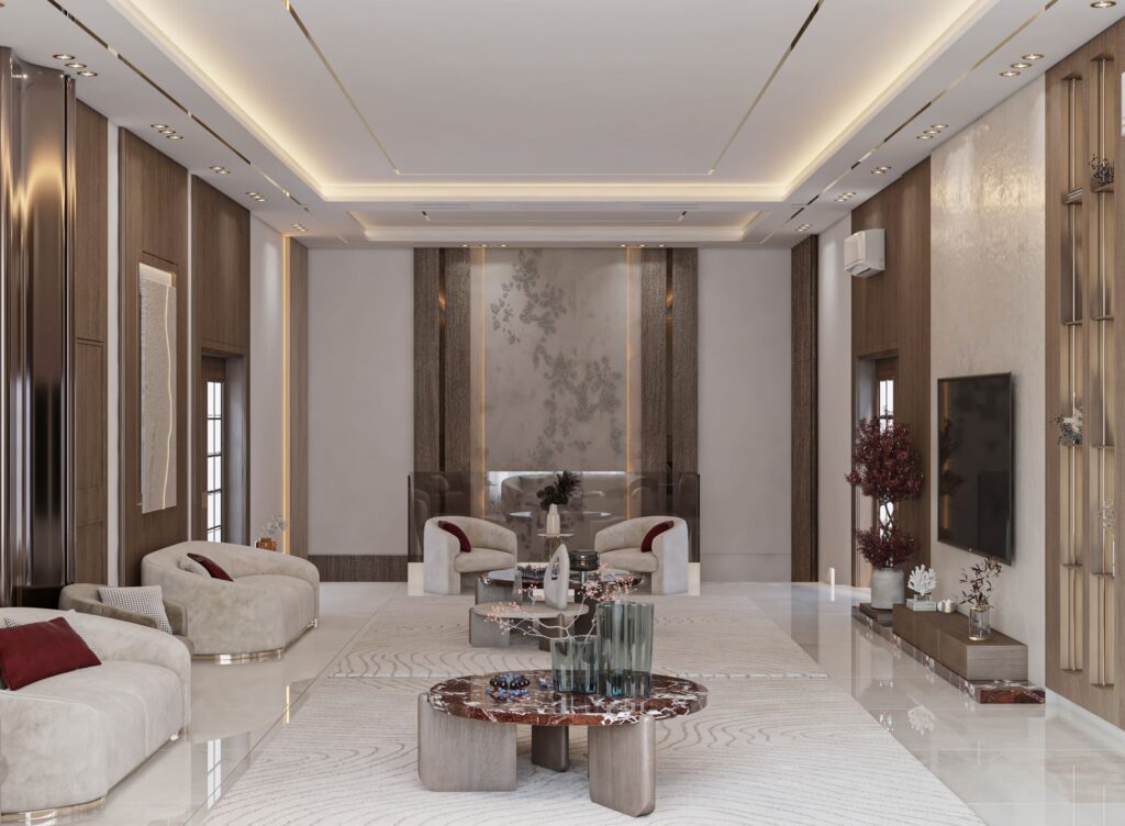
- Gray: A sophisticated neutral shade that sits between white and black, representing tranquility, balance, and understated elegance. Highly versatile, it provides a seamless backdrop for other colors and is widely used to achieve contemporary, refined interiors.
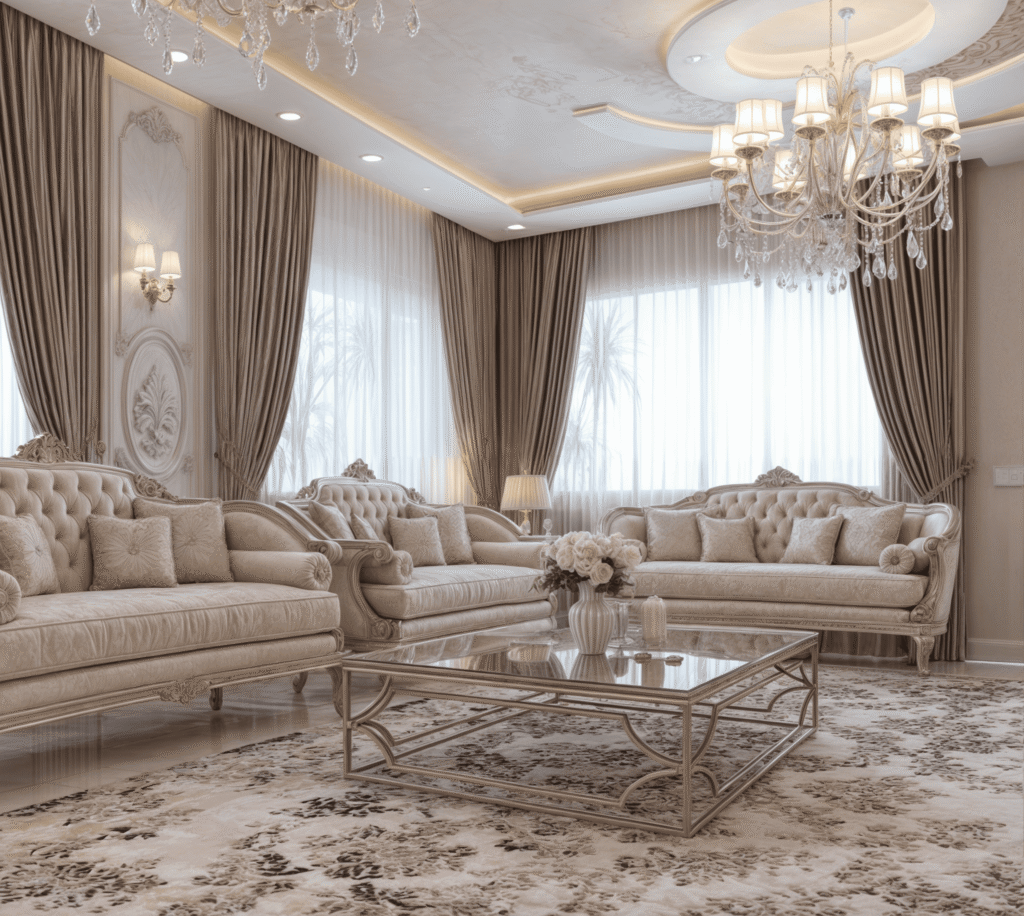
- Beige and Cream: Soft, warm hues that evoke a sense of comfort, coziness, and relaxation. Often used as elegant alternatives to pure white, these tones lend interiors a welcoming, intimate character. How Can Color Psychology Be Applied in Interior Design ?
In interior design, it’s essential for the designer to consider several key factors when selecting a color palette, including:
- Room Function: The choice of colors should align with the intended function of the space and the atmosphere desired. For instance, serene and soothing hues are ideal for bedrooms, while brighter, more energetic shades suit living rooms and social areas.
- Room Size and Lighting: The selection of colors significantly impacts how a space is perceived. Light tones enhance brightness and create an illusion of spaciousness, while darker shades introduce intimacy and depth. Additionally, both natural and artificial lighting should be carefully considered, as they influence how colors appear throughout different times of the day.
- Furniture and Décor: Selected wall and flooring colors should seamlessly complement the tones of furniture, fabrics, and decorative elements, ensuring a harmonious and visually unified interior composition.
- Personal Preferences: At its core, color selection should resonate with the personality, lifestyle, and unique identity of the space’s occupants, ensuring the environment feels both comfortable and emotionally uplifting.
- Cultural Influences: It’s essential for designers to understand the cultural symbolism and connotations of colors, recognizing that meanings and emotional responses can differ significantly across cultures. Practical Guidelines for Applying Color in Interior Design:
- Begin with a Color Palette: Develop a well-balanced color palette featuring primary, secondary, and neutral shades to establish a cohesive and harmonious visual direction for the space.
- Apply the 60-30-10 Rule: A classic guideline for achieving visual balance, this principle suggests allocating 60% of the space to a dominant color, 30% to a secondary shade, and 10% to an accent hue — ensuring a harmonious and dynamic interior composition.
- Embrace Bold Choices: Don’t shy away from incorporating bold or unconventional colors to infuse your space with distinctive character. However, ensure these choices are thoughtfully balanced and harmonized within the overall design scheme.
- Test Your Color Choices: Always sample colors on-site before committing to large surfaces. Observe how each shade responds to the room’s natural and artificial lighting at different times of the day to ensure the desired effect is consistently achieved.
- Leverage Color to Define Focal Points: Incorporate bold or contrasting hues to highlight key architectural elements or accentuate standout furniture pieces, creating visually engaging moments within the space.